One of our workshops shows you how to ensure that your website is accessible to all potential clients. It might sound like a dry subject, adhering to a standard: WCAG 2.1, but in reality it’s both interesting and important.
Why is accessiblity interesting?
It makes you think about how others interact with the online world. What happens to someone looking at your website if they:
- can’t see very well?
- are colour-blind?
- are deaf?
- have physical disability that stops them using a mouse?
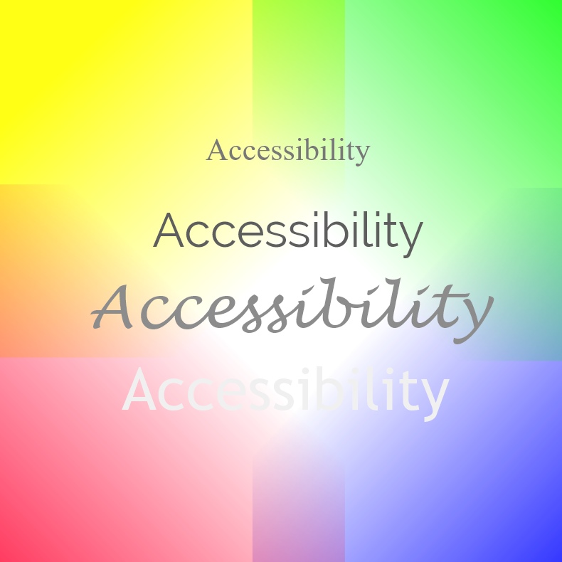
How fonts and colour affect what you see
The image we used for the workshop has been designed to show how some people can be affected by the fonts and colours you use on a website.
Think about how legible the fonts are, how they appear on different backgrounds and the size of the writing. Simple, clear fonts are best but you should also consider contrast. You can see in the image how light fonts on a light background are unreadable and how curly fonts are harder than sans serif ones.
Making your site accessible is important
Making sure that your site complies with the WCAG 2.1 accessiblity guideline helps not only your clients, but you as well.
- Your potential clients could have any of the above problems. Do you want them to turn away just because you’ve made a website they can’t use?
- Google looks at accessibility as part of its SEO score, so it’s a good way to earn a few more brownie points.
Whilst some organisations have to be compliant with this standard, for others it’s also a good way to improve your standing.
Check out your own site
Have a look at your website from someone else’s point of view and see what it looks like. You’ll find tools to help you here on WebAIM.
Or come on one of our workshops to learn more.