When you are setting up an online shop, it is worth giving yourself some time to think about how you’re going to lay out your virtual premises. Just as with a retail shop on the high street, you need to use some psychology to make sure you maximise your sales.
It doesn’t matter what sort of shop you’re creating (e.g. WooCommerce, Shopify, SquareSpace, Etsy) the rules here apply to all shops.
1. Think about your online shop window

If you have a retail shop, the display in the window is what draws customers inside. You need to keep it up to date, showing off the latest trends in an attractive manner. This applies whether you are selling spanners or beauty products; it’s just what your customer considers attractive that will change.
In the online world, the equivalent actually two things:
- Your entries in search engine results
- Your front page
To get clicks through from a search engine, you need to make sure that you have the right page title, so that a user will recognise that your page is indeed selling what they want. You also need to put enticing words in the metadescription, to reassure them that what you’re selling is really what they want.
Your front page is the equivalent of the view when they reach the doorway to your shop. Yes, it needs to look good to entice them further, but it must also make it clear to the user – your potential customer – where they need to go to get what they need. A beautiful page with no signposts will do you no good.
2. Think about your online shop layout
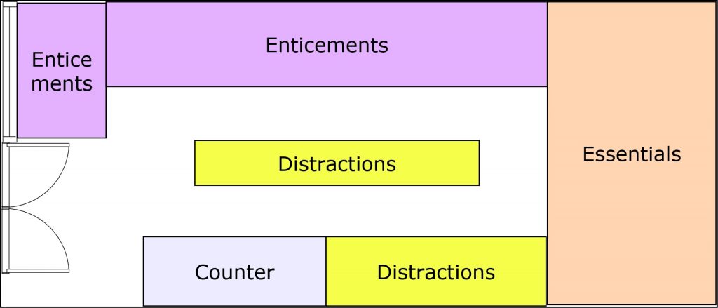
Again, psychology comes into play. In a retail environment you can divide your products into three types:
- The products you want to push on offer – enticements
- The essentials that everyone has to buy
- The extras you want them to pick up – distractions
Your retail shop is laid out to make sure you maximise the chance of selling all 3. Offers are displayed prominently, essentials are put at the back, to make people walk past everything. The extras are displayed to catch people’s attention – at the end of the aisles, near the till, for example.

For an online shop, the special offers need to appear on the front page and also on other pages (perhaps in the sidebar, for example). The essentials are in the general shop, but need to be well categorised so that people can find them easily. The extras, in online parlance called cross-sells and up-sells, appear beneath the product currently displayed and on the basket.
Up-sells are items that are closely related to a product someone has just put into their basket. Examples would include thread with material, other ingredients to go into a particular recipe, paper with pens.
Cross-sells are not quite so directly related, but things that people are likely to buy. Just think of the items at the bottom of a page on, say Amazon, where you get “People who bought this also bought…”.
Summary -think before you leap
Thinking about your shop structure up front will save you hours and hours in the future and increase your sales. Yes, it may sound like hard work when all you want to do is get your products online as fast as possible but it is well worth it, if you want to build a successful online business.
Want to know more?
We run workshops on various aspects of setting up and managing an online shop. Click to find out more.


