

The importance of branding
Getting the right look for your business/ product/ company is essential in today’s very visual world.
Logos give instant recognition
We have a slide which we use at several of our workshops showing about 30 different logos from well known companies. All are instantly recognisable and make a statement about their business. You don’t need other words or images to tell you who you are looking it.
You can change a logo, but be careful
If you have such a recognisable brand, you can change it but you need to be very careful how you do so. You don’t want to lose people along the way. Looking though the ones in our example slide, you can see when companies do change their logos they keep at least part of it the same. Think BP or Google: the shape and font have changed but the colour scheme has not. McDonalds is an interesting one: the TV advertising still shows the red “M”, but the restaurants are dominantly green.
It is a similar thing with products. I came completely unstuck a few months ago, searching for my regular brand of bread flour. The company had re-branded: changing to monochrome throughout their range and changed the size of the bag. My strategy of looking for the big bag with the brown band had to be changed radically! Only last week, I found that Tate and Lyle had rebranded all their sugar bags and in addition had renamed caster sugar to baking sugar. I really wasn’t sure I was buying the right thing. I guess they just thought that no one knew what a sugar caster was these days.
Branding is more than just a logo
I was challenged once to describe the Amazon logo and failed miserably. Land on their website though and you instantly know where you are. There are hints everywhere – the colours, fonts, organisation, layout (and the cheery offer of yet another Kindle!).
This is where the visual art of branding meets the nuts and bolts of software engineering. A well defined brand will make the software engineer’s job a lot easier. The brand look and feel will dictate theme selection and configuration. A colour palette and defined fonts makes it easy to be consistent. This is called a style sheet.
Make a style sheet for reference
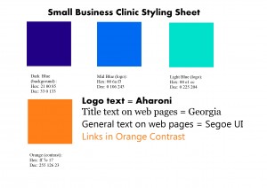
There are different ways of representing colours in computers: RGB, CMYK, decimal and hexadecimal (hex). Different packages that you might use to create branded copy will use one or more of these representations. WordPress, for example, uses hexadecimal (hex) – the string of six characters with a # in front (not to be confused with a Twitter hashtag!).
Unlike Twitter hashtags, these representations are quite hard to memorise. I suggest you create a style sheet: a simple page with blocks of the colours from your brand on it and beside them write the different colour representations. Add to this the fonts you use, print it out and pin it up somewhere convenient. That way you won’t need to keep rummaging around every time you need to create some new marketing material. The pictures shows the sort of thing you need.
A couple of techy tips
Particularly where branding meets computer hardware and software or a budget, there may have to be some compromises. I have two tips on how to make the life of the software engineer easier (and therefore cheaper to you):
1. Use the right Photoshop Output options
Tools like Photoshop will embed extra instructions into an image file so that the colours will display identically on different screens. Unfortunately colours specified elsewhere on a website do not get the same treatment. If you need to continue the colours of your logo/ artwork/ images onto the rest of your website, make sure your files are saved for web. This will ensure that everything defined as “#34f678” will be the same colour.
2. Check what happens on different devices
Not everyone viewing your website will be running state of the art hardware and software. While your branding may include a stunning font, if this is not available on a device then the local software or browser will use a substitute. Also, if you are using tools such a MailChimp, the range of fonts is quite small.
Be aware of this and check that the substitutes you specify are acceptable to you, or be prepared to pay more for a solution that ensures that everyone sees what you want them to.
Once you have it, use it
One final thought. Branding is generally considered as part of the marketing remit and therefore very much public facing. As a company grows, your branding can be used to reinforce its identity. You have a color palette. Create an Office theme in your company brand, then these colours can be used everywhere; in sales charts, internal software and management reports, for example.